
Why update visuals?
My first impressions looking at Flow were that it was colorful, connected to a lot of apps, cloud-based and so on. That said, it didn’t feel very ‘Microsoft’. There was also a busyness and visual heavyness to it, that I found fairly distracting - specifically regarding the way that templates are portrayed in the portal.
These impressions were affirmed in the usability testing that we did shortly after I joined the team. Users found the visuals overwhelming, especially when searching for a template. Additionally, several of the colors bleed into each other, causing some uncomfortable vibrations.
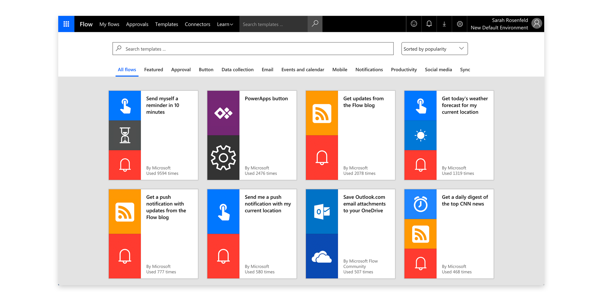
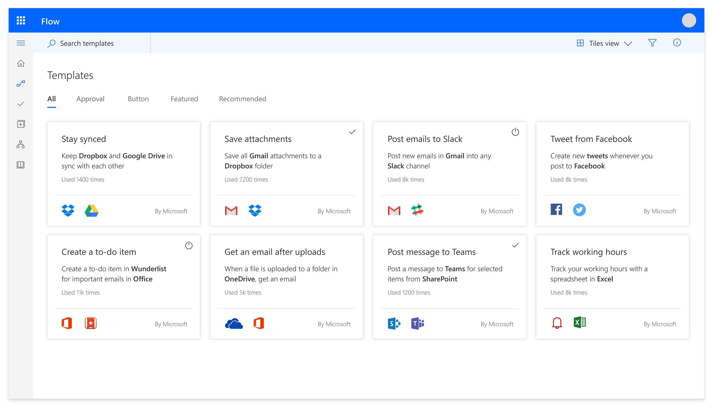
This is an example of the old templates page. The cards show icons next to each other on brightly colored backgrounds that sometimes vibrate or create inconsistent borders next to one another. During usability studies, we found that users were visually overwhelmed by this style of template cards. Additionally, the multitude of pivots across the top of the page didn’t help provide a guided experience for an already visually dense surface.
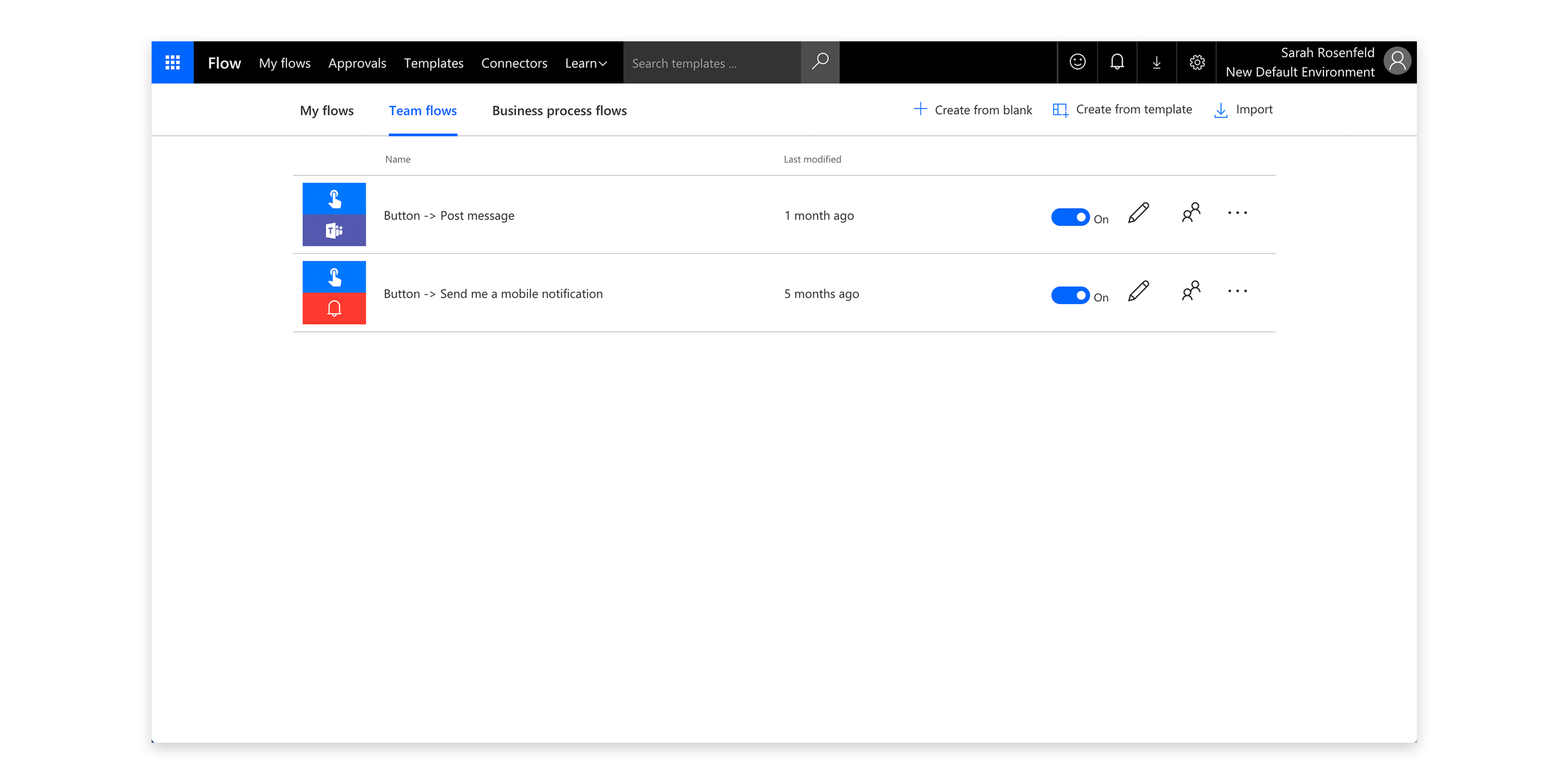
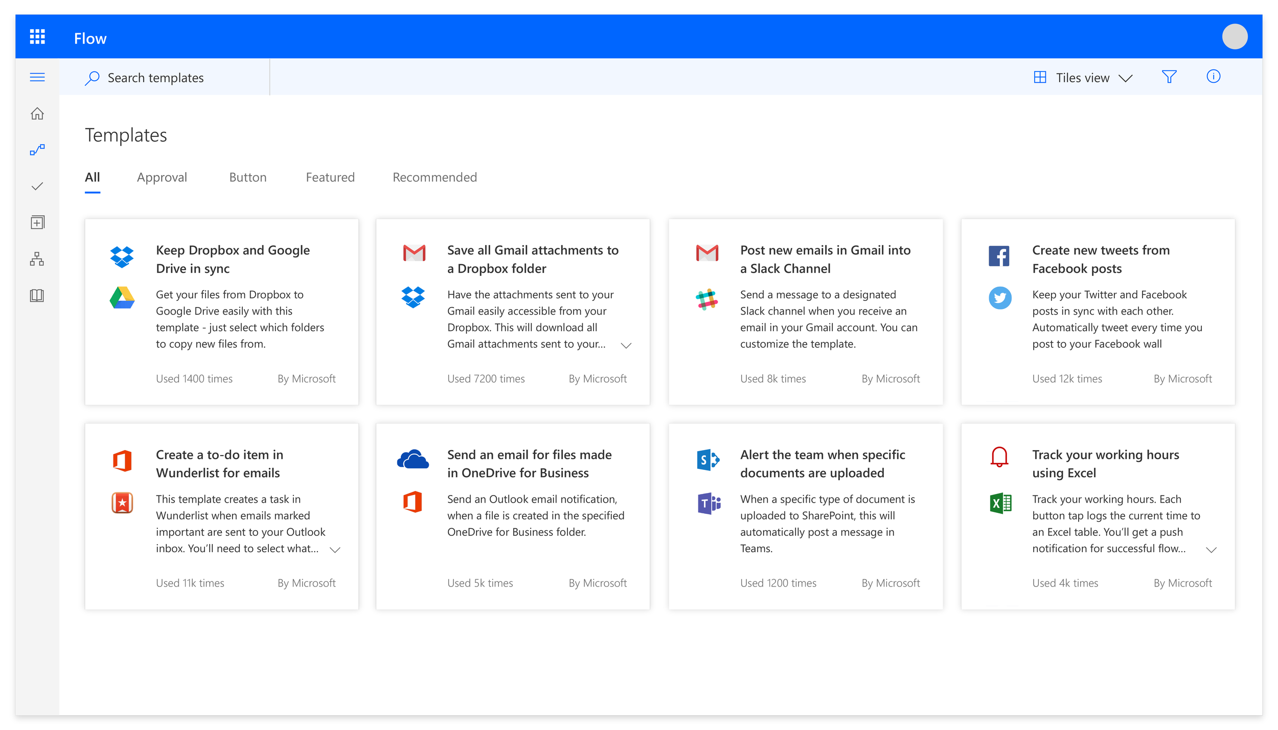
This is an example of the old list style for the Flow portal. Flows are represented by the box with combined icons and the name of the flow. The rows are very tall, not allowing for very much information density. Additionally, the list style doesn’t align to other styles used by Microsoft or in the suite in terms of spacing, typography, iconography and which information is represented.
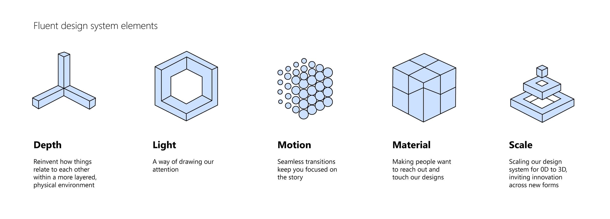
The goals in updating the visual style of Flow are to leverage Microsoft’s new Fluent design system, and align to the rest of the Power Suite platform (Flow, PowerApps, Power BI + Admin), as well as Microsoft as a whole - specifically Office.
The Fluent design system is well-defined and has some specific tenets that we looked to adopt. These are:
Natural on each device - Fluent experiences listen and adapt. They feel natural on the devices people use, from tablets to laptops, from PCs to televisions.
Intuitive and powerful - Fluent experiences adjust to behavior and intent - they understand and anticipate what's needed.
Engaging and immersive - The physical world is our vocabulary. Fluent speaks in light and shadow, in spatial dimensions, in the weave and fold of fundamental materials.
Applying Fluent to Flow
After understanding what Fluent encompassed and how to use it, my team worked on applying it to our product suite. This started out as a studio-wide alignment effort, with design leads from each product team attending syncs focused on a single surface and experimenting with how to apply the new Fluent design principles.
Next, we identified designers on our team to participate in a v-team dedicated to building out sharable components. The v-team put together a components library in our design tool, Figma that was re-usable for the different products with brand themes that could be applied. I helped guide and review these components as they were implemented. On the engineering side, I attended syncs with one of my team members and other product reps with the engineers to help implement a shared code repository. This ensured that not only did our design specs align, but the actual end-products did too.
Design Process
Updating the way flows and templates were represented was a fairly big project because it has a lot of visibility and impact on not only the Flow portal but also every product that Flow integrates into. I led the efforts on this project and started with a lot of iterations. After mocking up several alternatives for representing flows + templates, I shared them with the design studio and product team to get feedback and identify the right direction to expand on.
Early explorations
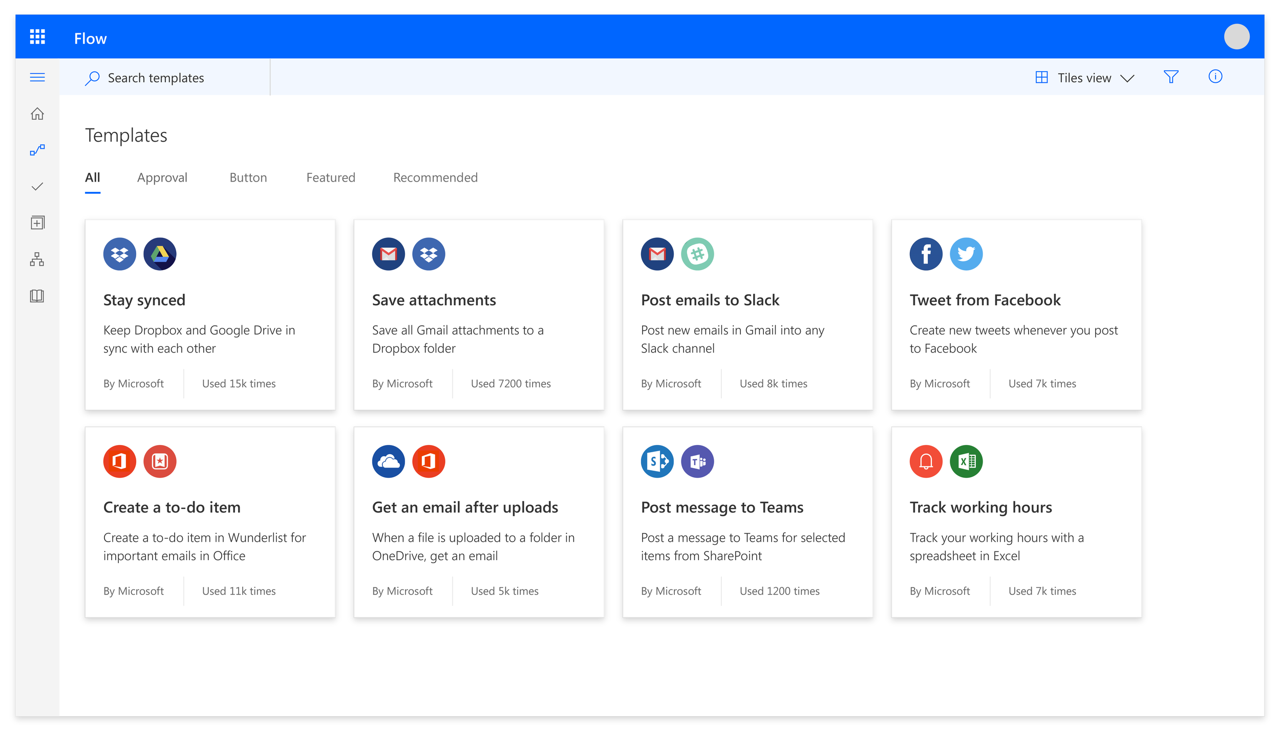
The left and below images represent some of my early explorations for how to apply Fluent design to Flow templates.
The above explorations were generally well-received but there were some constraints that I learned about after sharing them with the rest of the product team. Two in particular limited the way that we could represent Flow templates.
There’s a process for submitting new connectors to Flow. Part of that submission includes an icon. The way that we’ve historically asked for that icon is a white knockout on a large colored square background. The product team did not want to invest time at this point to go back and obtain new icons for all our connectors, so I had to work within the white knockout icon on square background.
One of my ideas (shown above) included updating the template titles. They’re currently fairly long. I thought we could break out that content by making the titles more succinct and clear, and consider adding a subtitle with more detail. This would help with quicker recognition of templates as well as adding some visual hierarchy. However, the product team also did not want to make the time investment in reaching out to all the template authors and retroactively updating titles and descriptions. (There are hundreds of templates!)
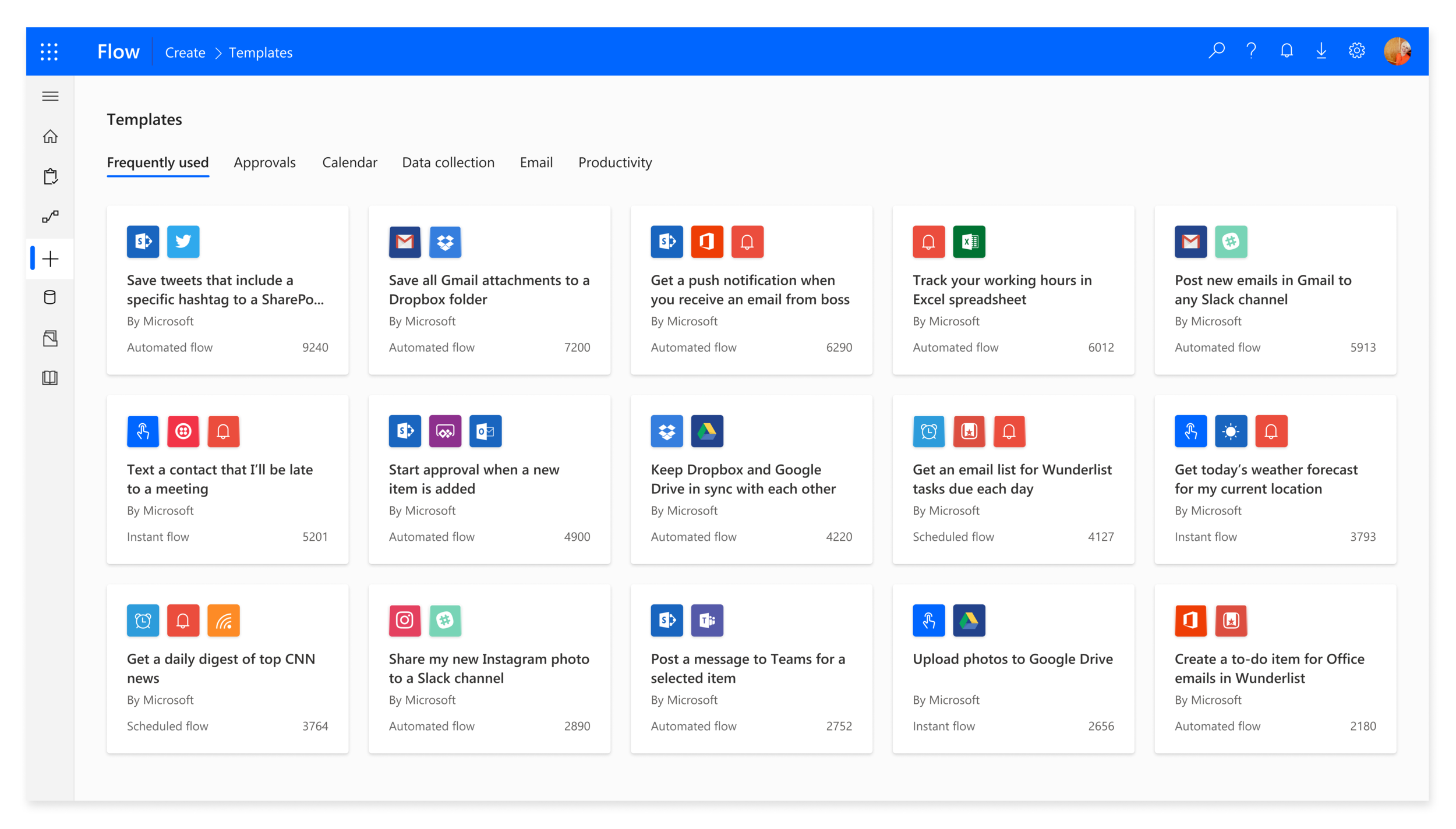
With this information (white icons on colored squares + no template title changes), I went back to the drawing board. One of the Fluent design changes is moving from very harsh angular lines to softer and more rounded corners. I solved the icon issue by keeping them on colored squares, but rounding the corners and adding depth (another Fluent principle). Ultimately, I came up with the below concept for representing flow templates. One of my team members took it on from there and turned it into a polished spec with designated responsive behavior and shared components.
Representing flows in a list presented another unique challenge. Since flows are unique from one another in the apps they connect, initially I looked for ways that we could show multiple icons in a list. I quickly realized however that this wasn’t scalable and was too much visual information in a list.
After doing some user research, we determined that a common way to think about your flows is by the trigger - where the flow originates. I was able to align with existing design patterns and other product list styles by using the trigger icon as the visual identifier for the list item. That, in combination with flow name was enough for a user to easily identify which flow they were looking for in a list view. It also really cleaned up and modernized the look and feel.
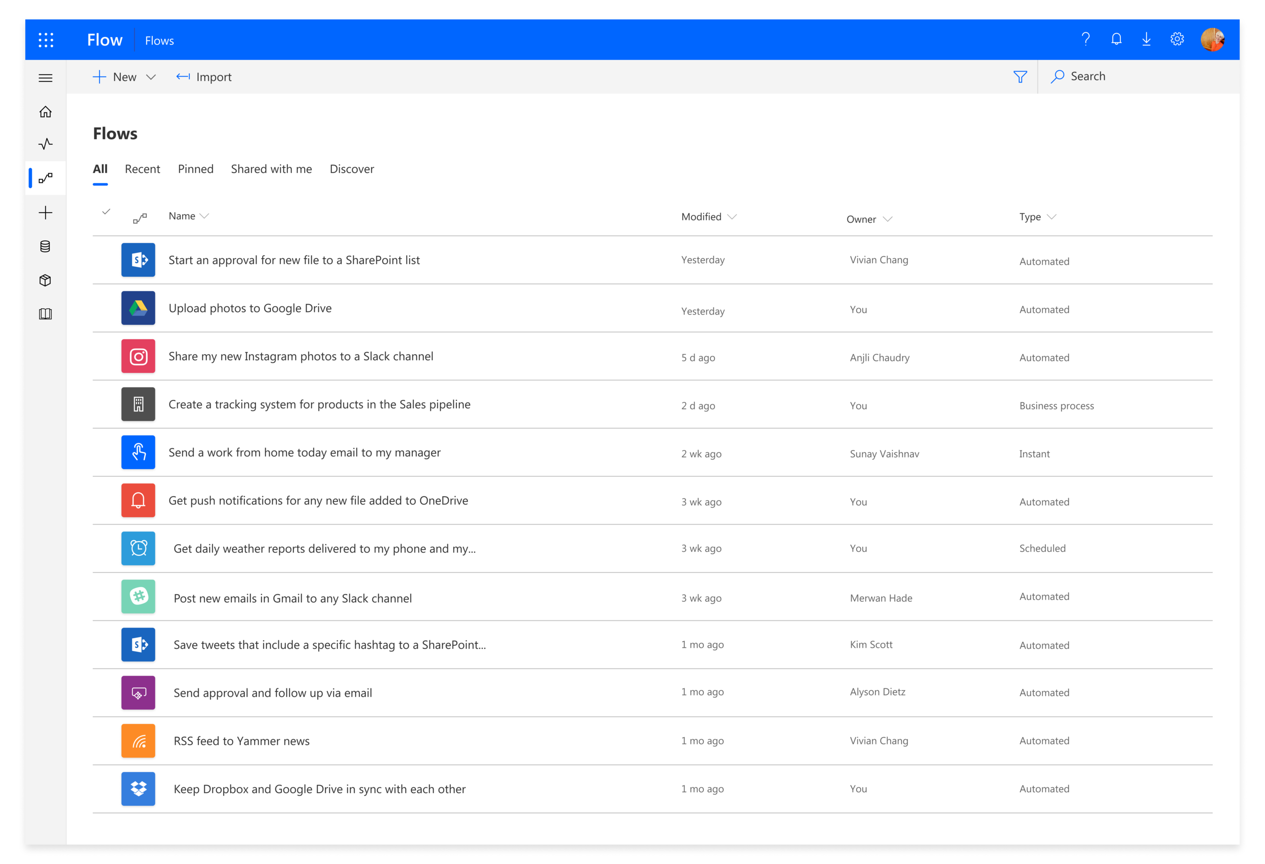
New flows list
The image to the left represents the new list style for flows. It leverages the Fluent principles of depth and rounded corners, as well as bringing in more hierarchy with the typography (bolded header).
Improved integrations
Another area where visual design updates are making a big impact is in our integrations with other products. We have an embeddable widget in the form of a pane that has traditionally used the old style of representing flows. This makes it challenging for users in other products because the design language is very ‘Flow-like’, and doesn’t feel like a seamless extension of the product they are in.
I leveraged Fluent design concepts and the updated iconography for Flow to come up with a widget design that is scalable and extensible and feels native to other Microsoft products (as opposed to only native to Flow). In this effort, I collaborated closely with the SharePoint team to ensure that our concepts of embedding Flow made sense to SharePoint end users. Below, see the difference from the old pane to the new. Previously, while the widget felt more like a ‘bolt-on’ to products it was integrating with, the new experience feels native and unified.
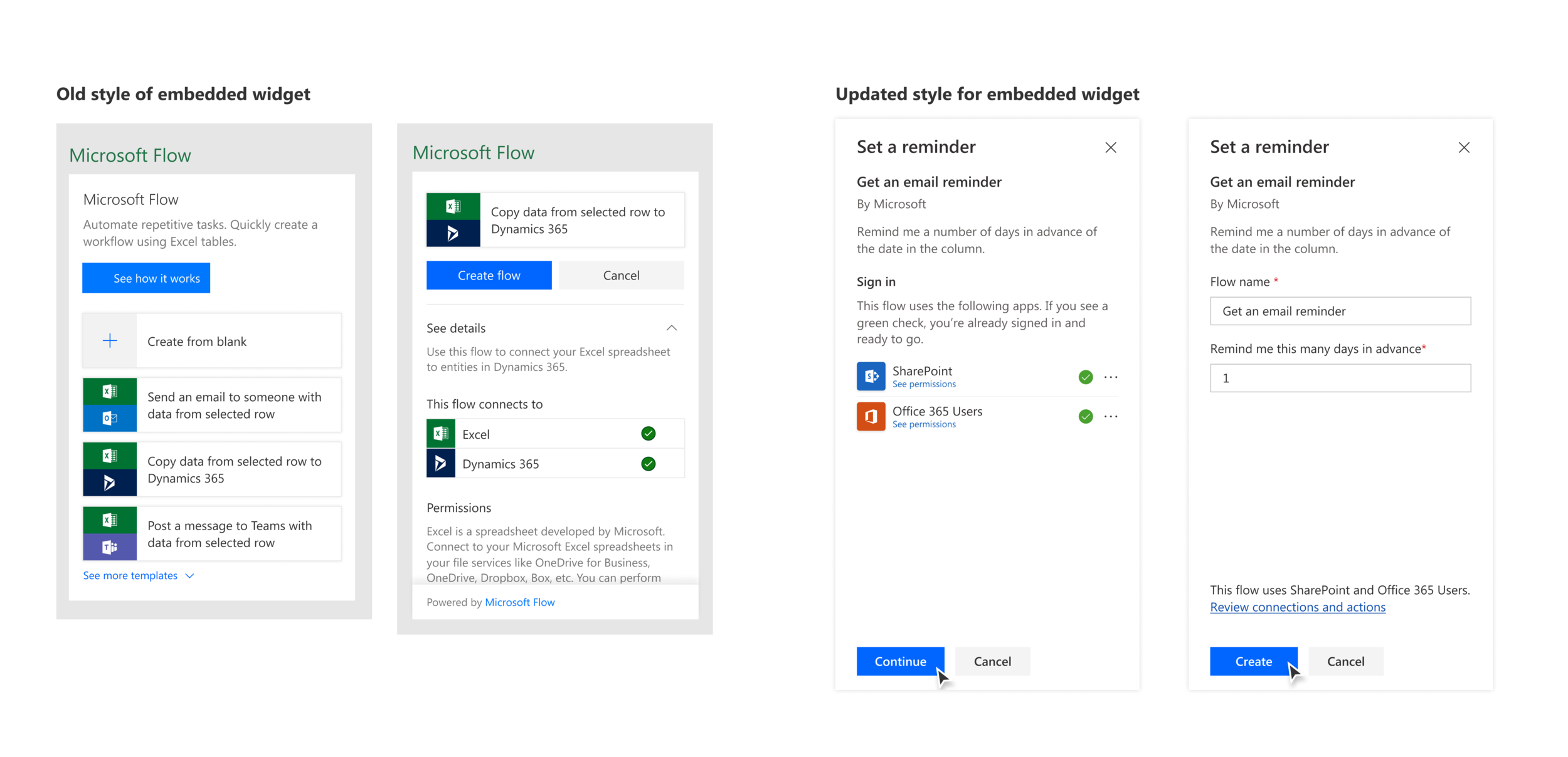
Updated widget design
Content also played a large role here in terms of reworking the information presented in a way that felt natural to the user in the task they were doing, instead of serving as an advertisement for Flow.
Measuring success
While this project is still rolling out, we’ve already received a lot of great feedback from users. Our NPS score has increased from 17 to 23 since implementing these UI updates. We’ve also received great feedback from our leadership team, specifically around improving the list style.
In user feedback sessions, participants have given an overwhelmingly positive response to the new look and feel of Flow.
“Very powerful and simple enough to use. Love the rate of innovation, it is awe-inspiring. Updates to cards have improved. Good job Microsoft for listening to users and implementing changes!”