Microsoft Flow
Microsoft Flow is a cloud tool that helps automate tasks by integrating apps together and using conditional logic. I took on the role of Design Manager for Flow in January of 2018. I spent time assessing the product and recent benchmark studies. I also helped launch a usability study. The results from these and my own personal assessment drove my decision to invest resources in updating the information architecture and layout of the portal.
Why re-design?
Being new to a product affords a great opportunity to view things with fresh eyes as a new user. When I first started on Flow, I took time to onboard and attempt to learn the product without the aid of the experienced product team around me.
I discovered several challenges:
The terminology wasn’t clear
What’s a flow? A template? A connector?
There was no clear CTA (other than search). I didn’t know how to get started.
The navigation was artifact oriented (with items representing unclear terminology), not action-oriented
When I finally got into the authoring experience, it was confusing and buggy.
The difficulties that I faced as a new user were replicated in past benchmark studies and a usability study that I helped launch. There was clearly a lot of information that suggested updating the user experience and chiefly the information architecture would be a worthwhile investment.
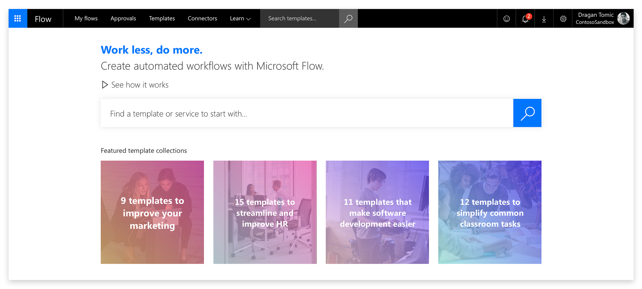
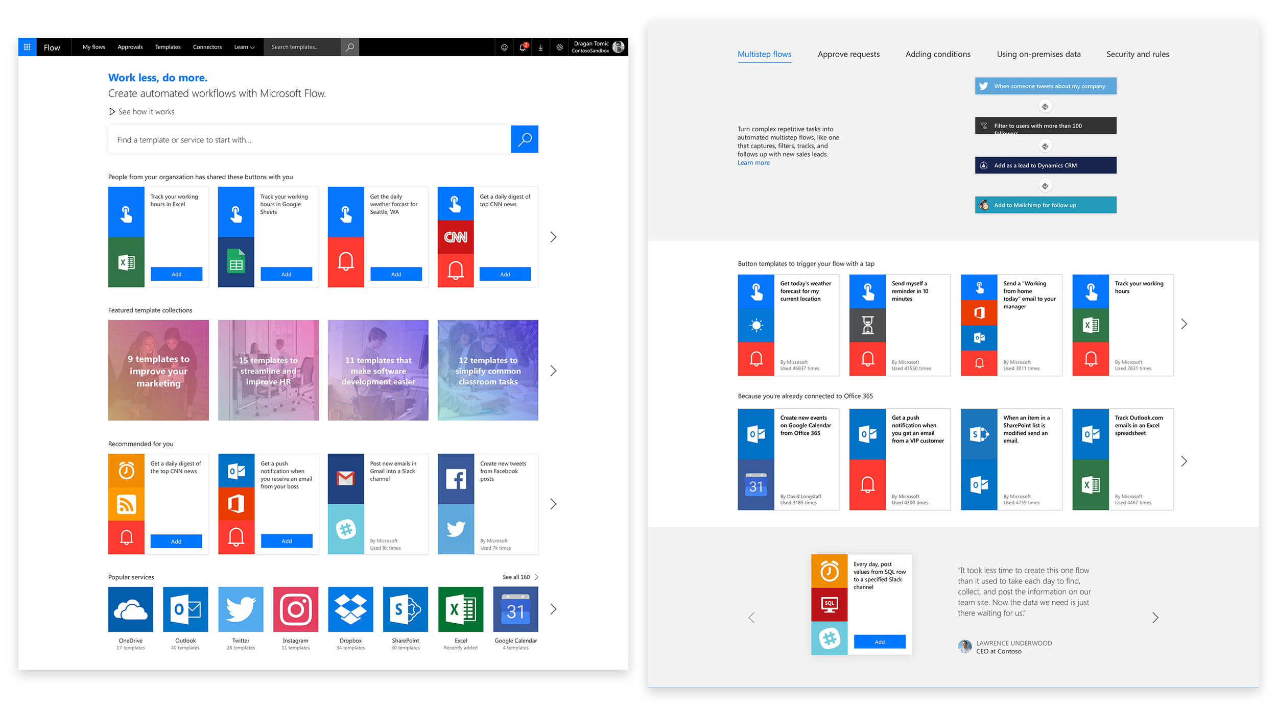
Original homepage and navigation. No left nav and no clear CTA beyond search. Navigation is organized by artifacts like “Templates” and “Connectors” and “Approvals”.
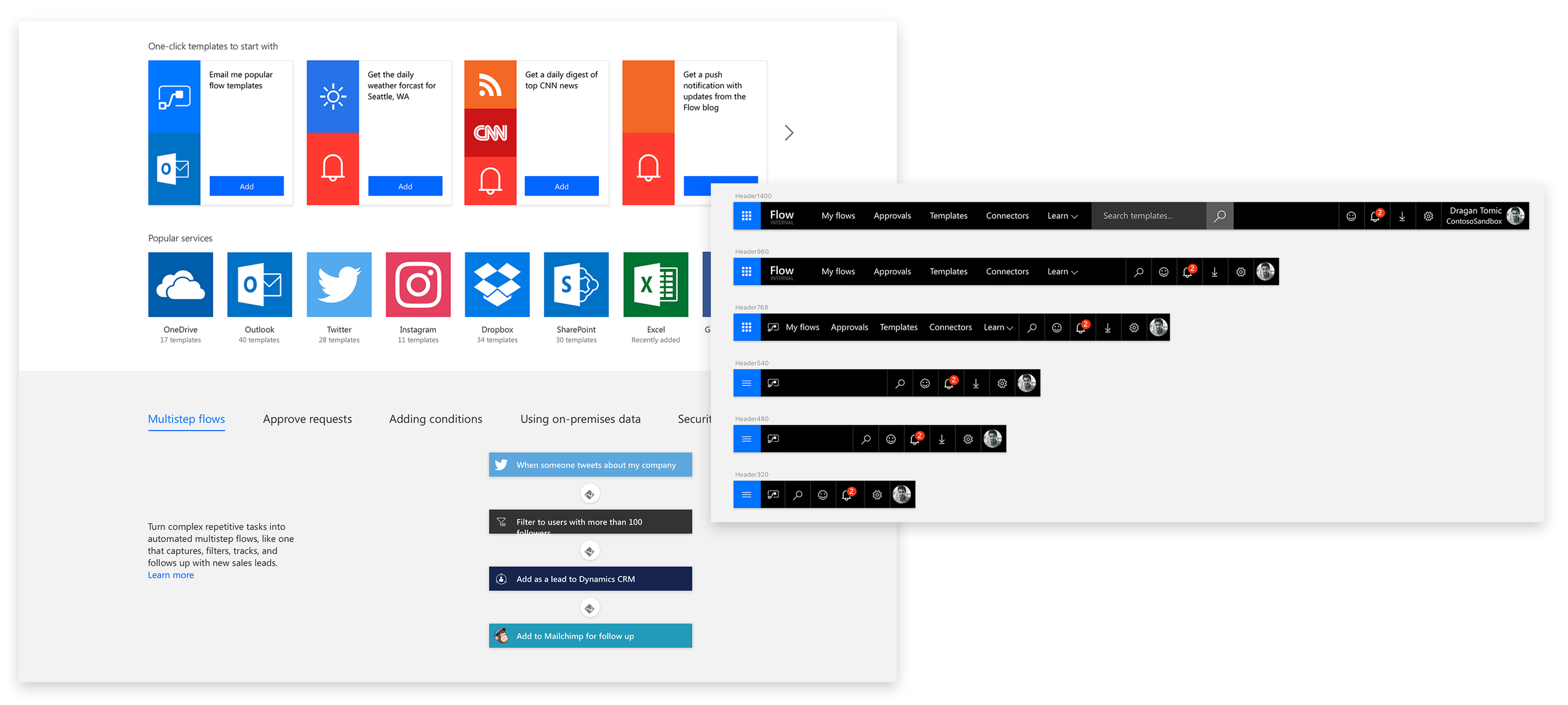
The left image shows some of the old homepage. Users are offered up a variety of content but limited explanations. In our usability studies, we found that the section below that explains the value prop required users to click through the pivots which they weren’t doing. They glossed over this section very quickly when presented with it. The layout also challenged users magnifying their screens because associated content was so visually separated.
Tackling the problem
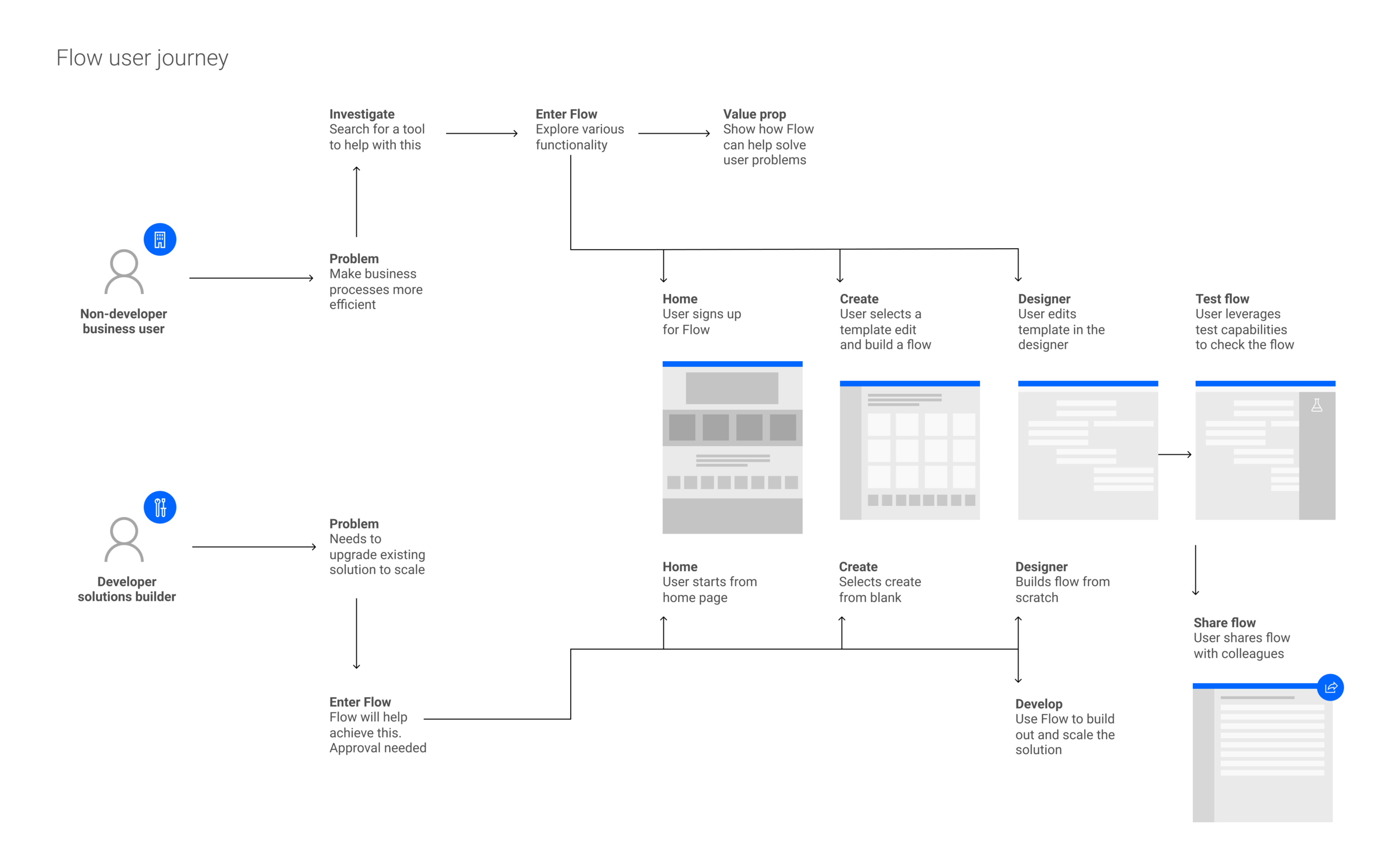
After realizing that the existing IA and layout of the Flow portal was not helping users navigate through the site, I led my team through a brainstorming exercise to start thinking about other ways of orienting users. In order to understand what might be needed out of an IA and navigation, I wanted to look at the core tasks that Flow users need to accomplish. I put together the following journey map to express this. In summary, users need to be able to understand flow (and flow types), make flows and consume flows.
Alternate approaches
We came up with three different alternatives:
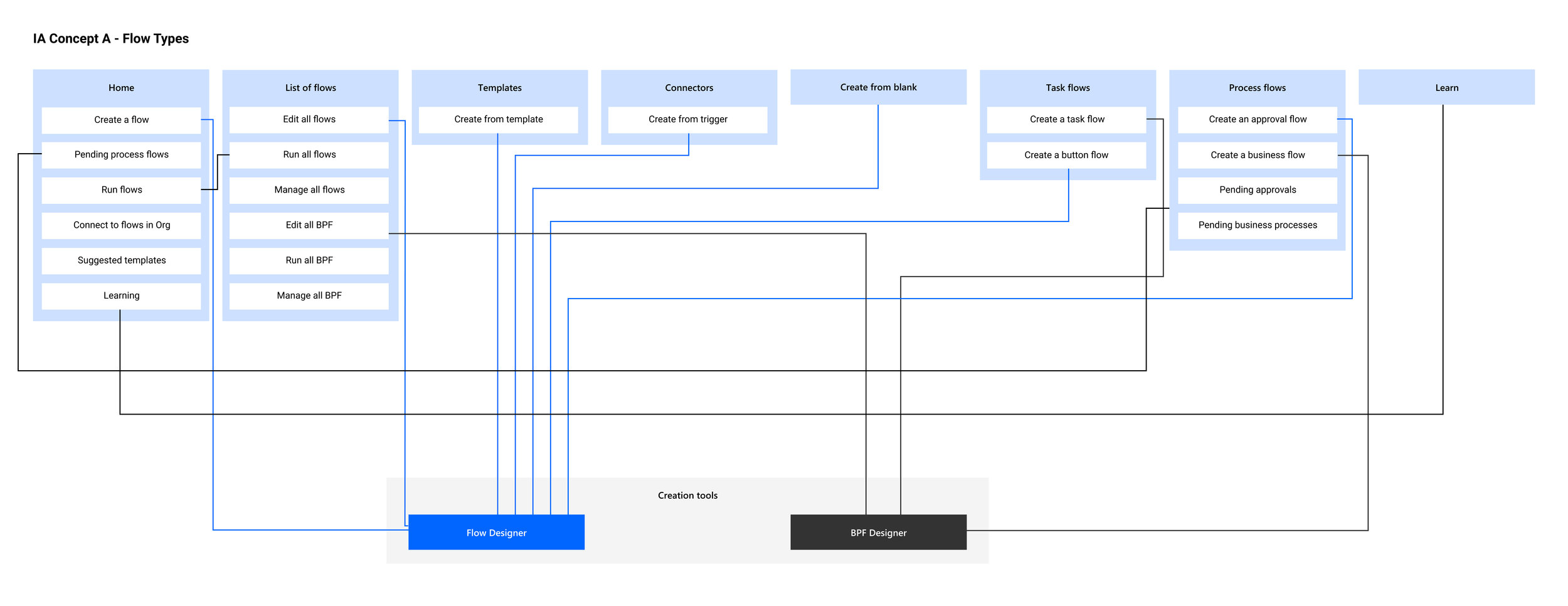
IA by flow type - This first IA breaks up the architecture by type of flow: process flows and task flows. It also includes a create from blank section and maintains templates and connectors.
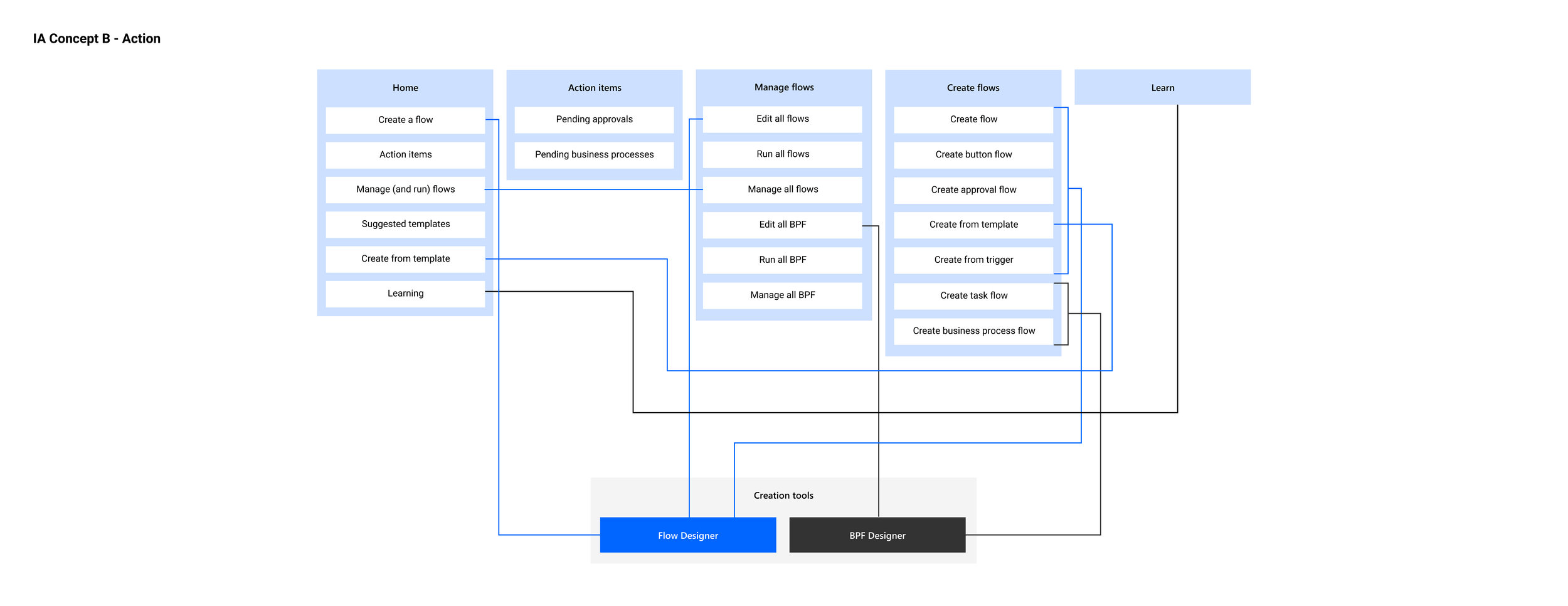
IA by action - This IA is broken down by what users can do in the portal. ie - Create, Manage, Act and so on.
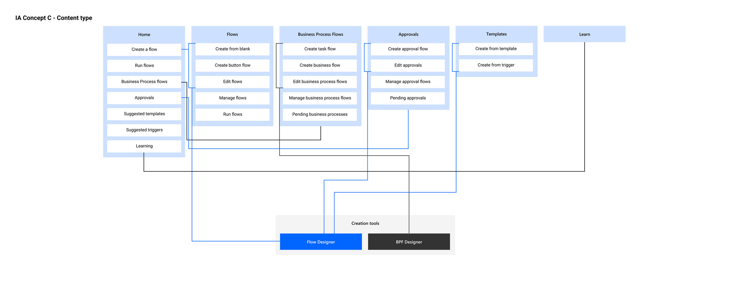
IA by content type - Content type breaks down the site by overarching category (Process flows, Flows etc) and then within each of those categories all the actions they can do - build, manage, share and so on.
User research
After coming up with a few alternate patterns for the info architecture, the next step was to conduct user research. Our UX research lead conducted two studies with the goal of identifying the most intuitive type of IA.
Study 1
In the first study, participants were randomly provided three versions of the IA via a navigation tree. They were given scenarios, tasks, and ease of use questions as well as a chance to rank the navigation types in order of preference. The content-type IA performed better than the alternatives in terms of user behavior, but the action-type ranked better in terms of user preference. We determined that we could nix the flow-type IA, but that more research was needed to move forward with action or content-type.
Study 2
In the second study, we wanted to better understand the strengths and limitations of the two IA structures (content + action type) as well as proposed changes to improve the usability of the homepage from the existing one. Participants were given prototypes of new and existing homepages along with some questions and the chance to rate them. They were then presented with different versions of the IA in the form of a navigation tree as before and given tasks, scenarios and the chance to give ratings. They were also asked to think aloud as they went through the exercises.
Findings
From the homepage portion of the study, we found that users showed a strong preference for the updated homepage. In terms of layout, they were interested in prioritizing the templates, learning content and capabilities of Flow over connectors, testimonials and marketing up-sells.
Regarding the IA portion, users most frequently selected the correct action in the action-oriented IA. There was a clear preference for this one over content type. That said, within the action-oriented IA, users had some trouble understanding what the different types of flows were. This led me to believe that while we could move forward with the action-oriented navigation, we needed to do a better job of explaining and reinforcing value props for the different types of flows.
Updated navigation
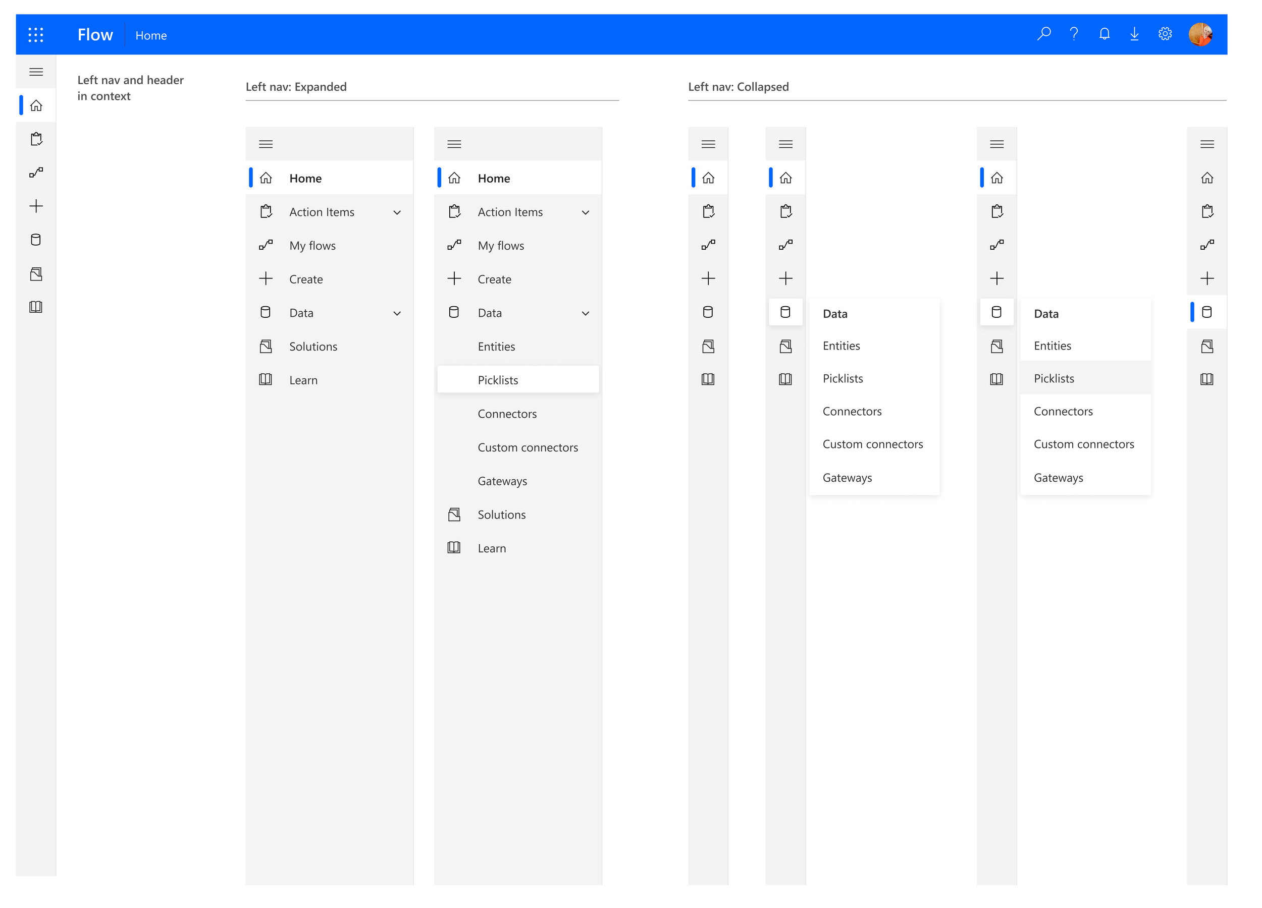
This image shows our updated left-nav oriented with the action-type information architecture. It also shows what the nav looks like in context with a new header. The style is updated as is the content.
Homepage research
Below are images of the original homepage. Some of the problem areas discussed previously are apparent such as:
No clear call to action aside from search
No clear explanation of terminology or value prop
Information overload - no clear way to navigate through all the content offered up.
Updated homepage
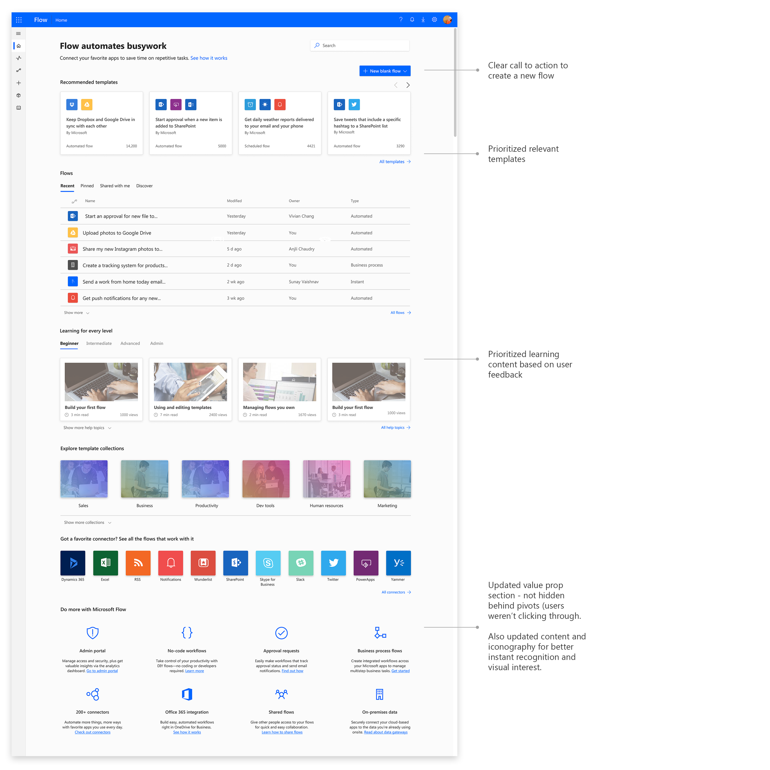
Here is the updated homepage based on our research. Some of the things that we did are:
Added a clear call to action (New flow)
Prioritized templates
Re-imagined the value prop section to be more easily consumable (We found users were not clicking through the pivots on the old homepage)
Prioritizing learning content
“What I like most about this page [new design] is the section at the bottom: Learning for every level. I really like the fact that there is this here because it allows you to learn how to use the product and become efficient at it no matter your skillset. I was surprised by this and I think it’s quite interesting to have a section like this.
”
Measuring success
The updated left navigation has already been quite successful in terms of user feedback. As we continue to roll this out, we’ll use a variety of methods to collect data and track impact. We have dedicated analytics on the UX team that will take telemetry to determine MAU, DAU, retention, success rates of building and using flows and so on. Additionally, we track NPS and relevant comments. On the UX side, we’re planning a benchmark study in the next couple months to see how the new and improved architecture has impacted usability.