
Storytelling
In the world of Power BI, storytelling means using data. The following project was born from a hackathon project, that was initially developed by MSR (Microsoft Research). In Power BI, we became interested in the idea of creating data bookmarks within reports and stringing them together to tell a story and share with colleagues. I led the design effort for this feature. We iterated very quickly to have it demo-ready for our annual Data Insights Summit, where it was presented at the keynote. Following the summit, we had the Summer to continue to design and develop before it was released in Preview this Fall.

The challenge
The problem I was trying to solve is: how can users bookmark different states of their reports and string them together to tell a story?
Design process
The evolution of this feature followed a less-than-ordinary path. Rather than starting with a spec, research, sketches etc, we started with a fully built-out demo from the hackathon. From there, we had to evaluate how bookmarking would be best leveraged for our personas. We made some changes to the existing demo experience, and tested them in user feedback sessions. We were still under a tight timeline, because the Data Insights Summit was only a couple months away.
At the Summit, we had the opportunity to showcase the demo on a computer, and interested customers could come up to our station, interact with the demo, and give feedback and answer questions that we posed. It was a great chance to learn about how our customers might use the feature, what they value from it and what their pain points were. From there, we continued to iterate, test, and review until we were ready to ship it for a public preview in the Fall (2017).
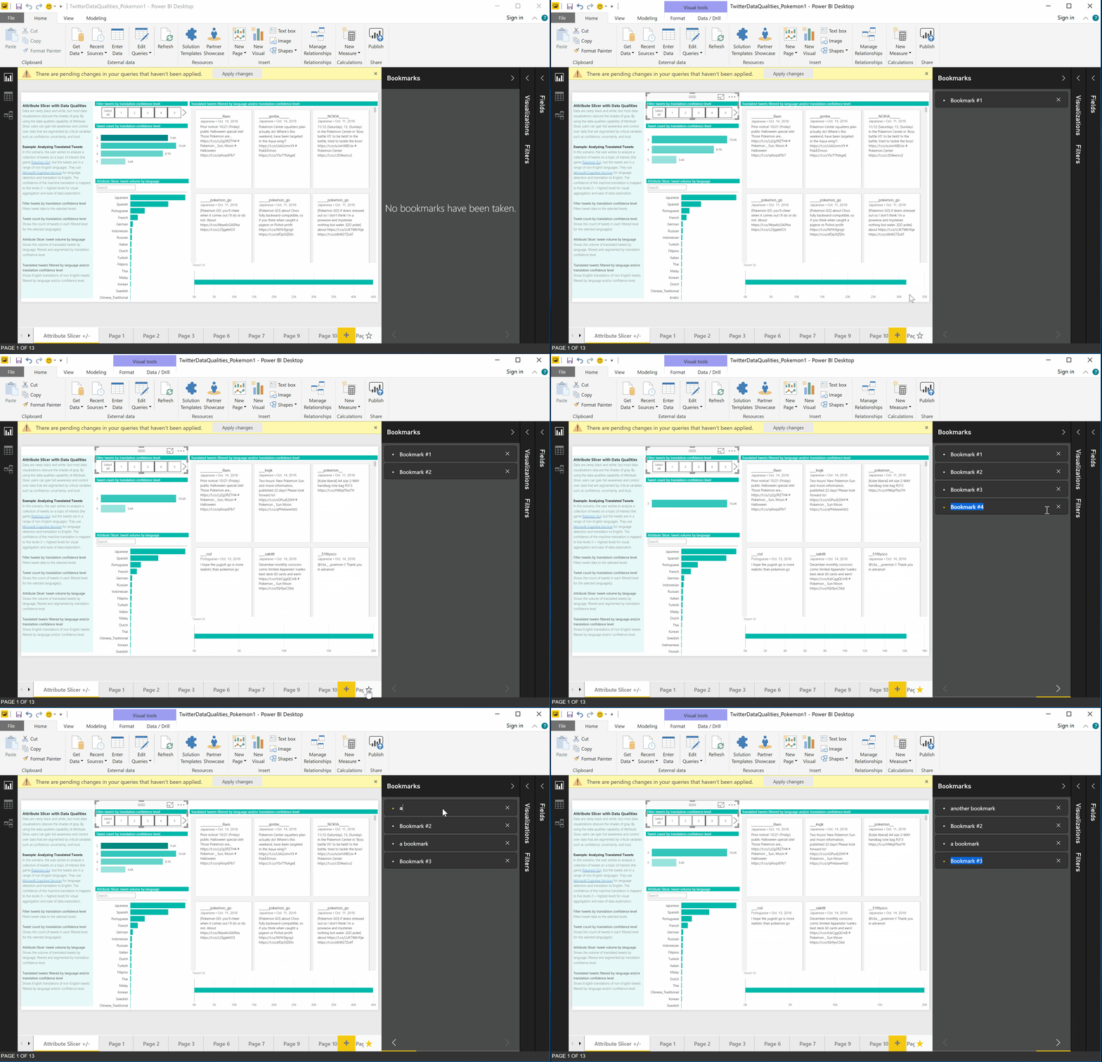
This is a video of the initial demo put together by the hackathon team, which was our starting point for the feature.
Design engagement
After building out the functionality for saving states for their hackathon project, MSR worked with the Power BI team to come up with something that would be demo-ready for our upcoming Data Insights Summit. The goal was to iterate on design, give a better and more intuitive user experience, with the caveat that it didn't have to be perfect because we'd have time to review and test after the Summit. Below are some early designs for how to improve this experience from a UX standpoint. Some of the high-level things I focused on were: creating a more intuitive way to add bookmarks, incorporating an entry point to view all bookmarks in succession, adding functionality to update existing bookmarks, and rolling it all into the existing Power BI Desktop UI so that it felt like a native feature.
Bookmarking features
Bookmarking or Storytelling encompasses several features:
The primary function is to save a particular state in your report - this could be a page, a filter, with or without a textbox etc.
These states can be organized in the bookmarking pane and then played back in a view mode.
Bookmarks are tied to the report, so when it is saved or shared, the bookmarks are preserved.
Show and hide
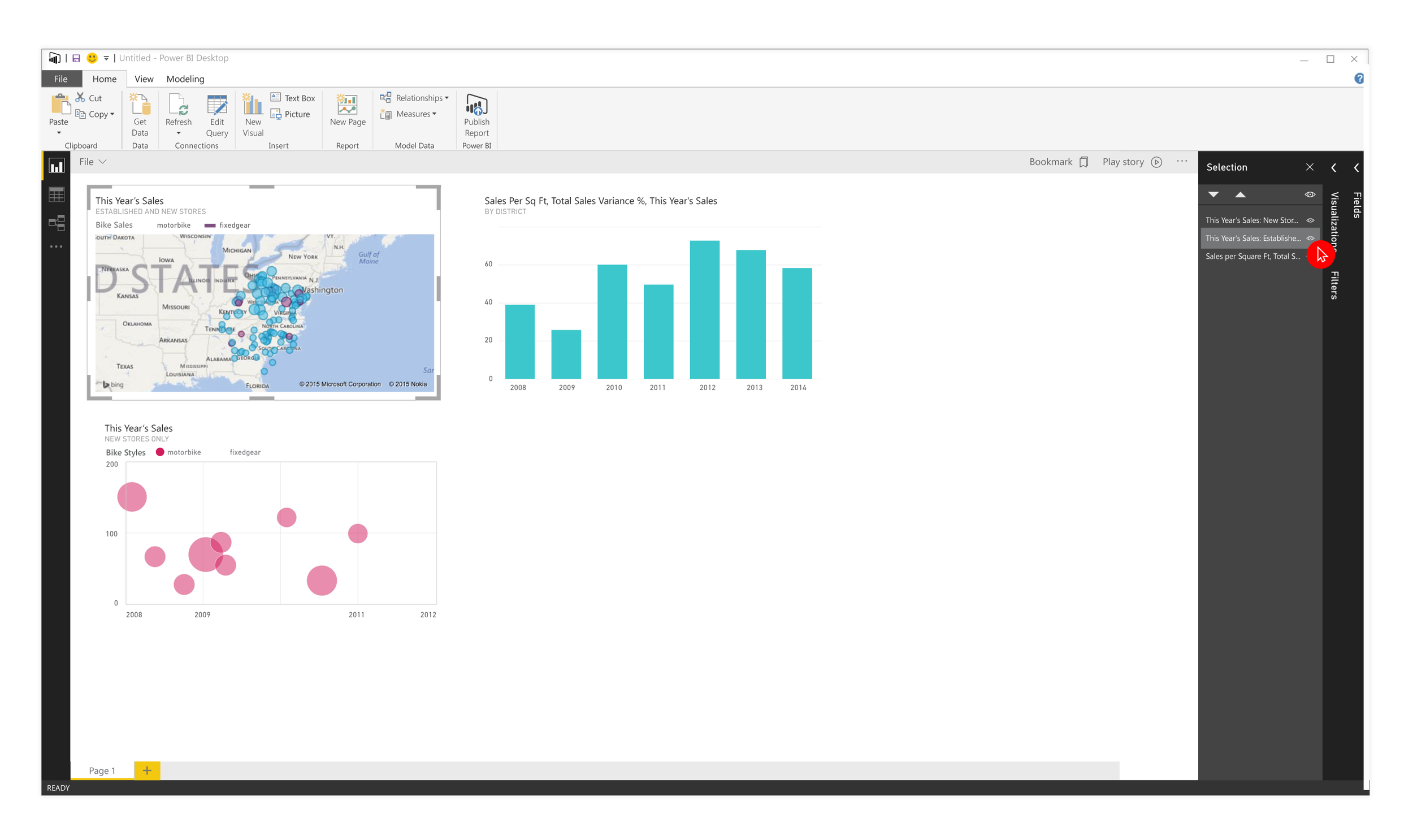
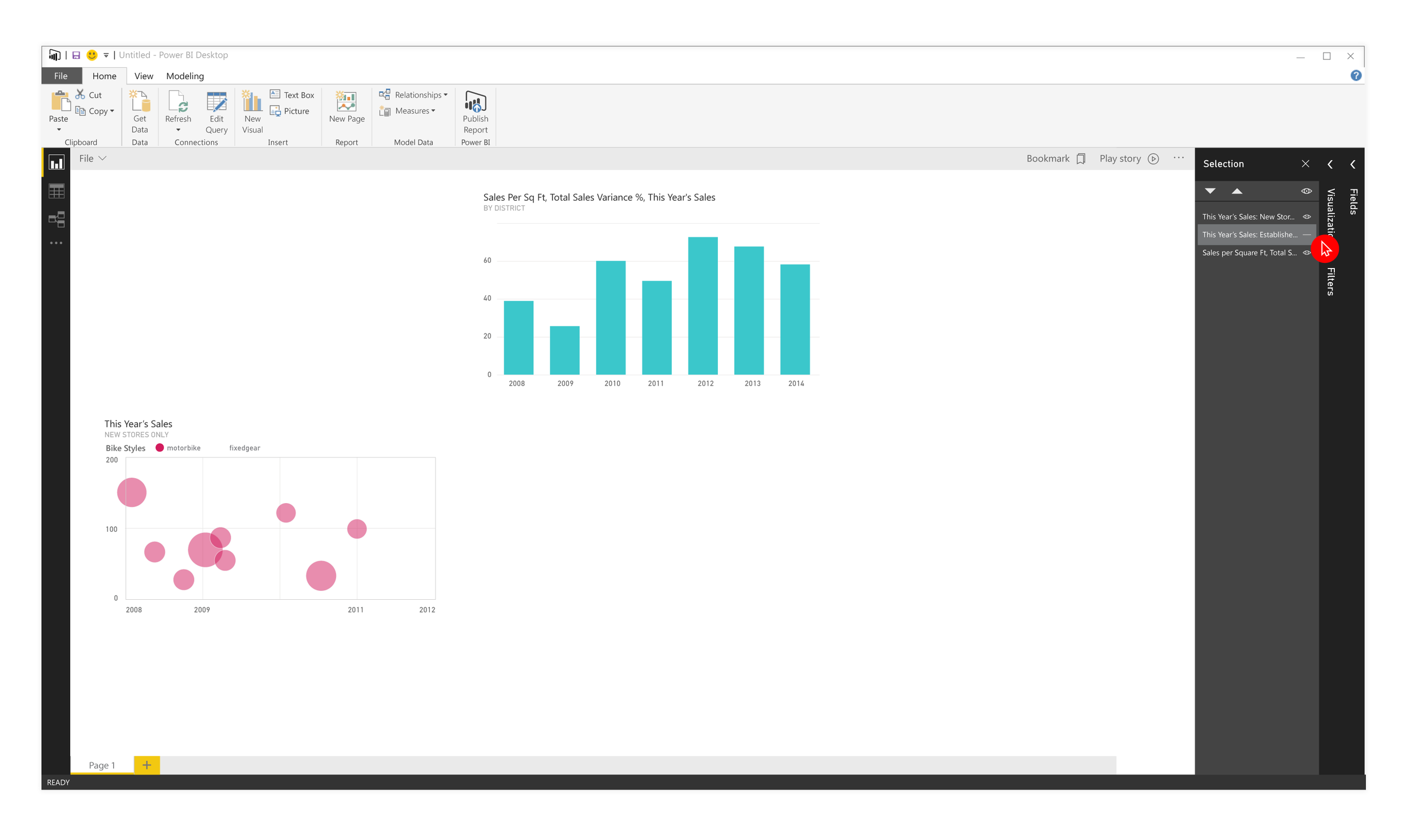
In addition to the basic bookmarking interaction, we also introduced a selection pane that allows users to show and hide elements on the canvas (see below) as well as change the z-order. We felt that this could be a valuable storytelling tool since it allows users to selectively share items on their report to help drive a particular narrative surrounding the data. Below are a couple early iterations on what that interaction might look like on a report, as well as the selection pane itself.
Bookmarks pane
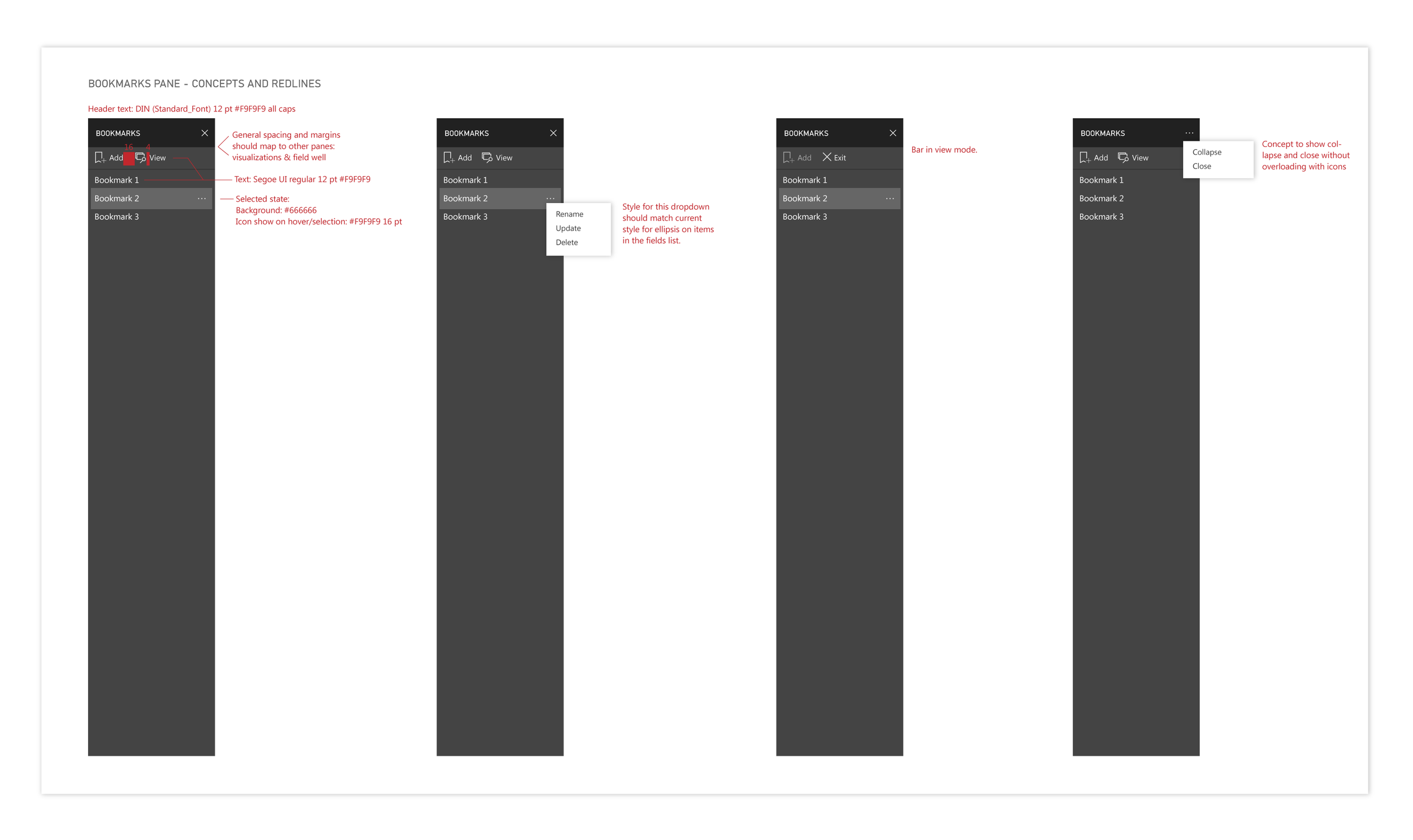
The bookmarks pane evolved over time from a simple list of bookmarks, to something more robust that could be re-ordered, updated, and played through. I also designed an empty state, so if a user pulled up the bookmarking pane for the first time, they would be able to get started with less friction. We also kept a persistent learn more link on the bottom of the pane that goes to bookmarking documentation to guide users through the process of creating bookmarks.
Basic functionality
This spec shows the basic functionality for the bookmarks pane. Primarily, users can add new bookmarks and view those that are already saved.
Additionally, they can rename, update (the data state) or delete an existing bookmark.
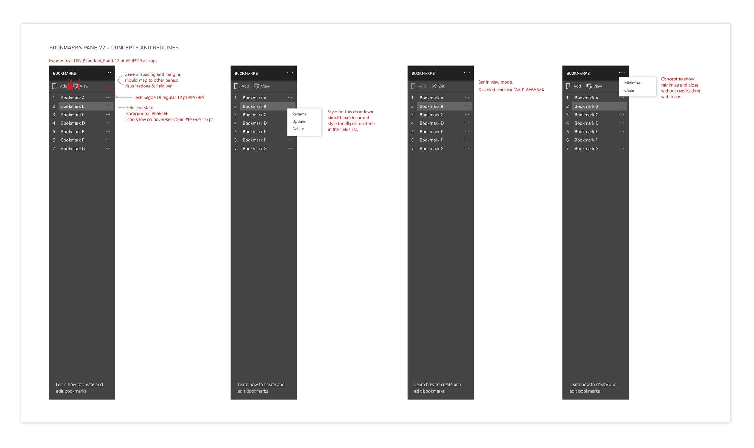
V2 for bookmarks pane
User feedback guided the decision to introduce numbering for users to keep better track of the order of bookmarks when telling a story with their data.
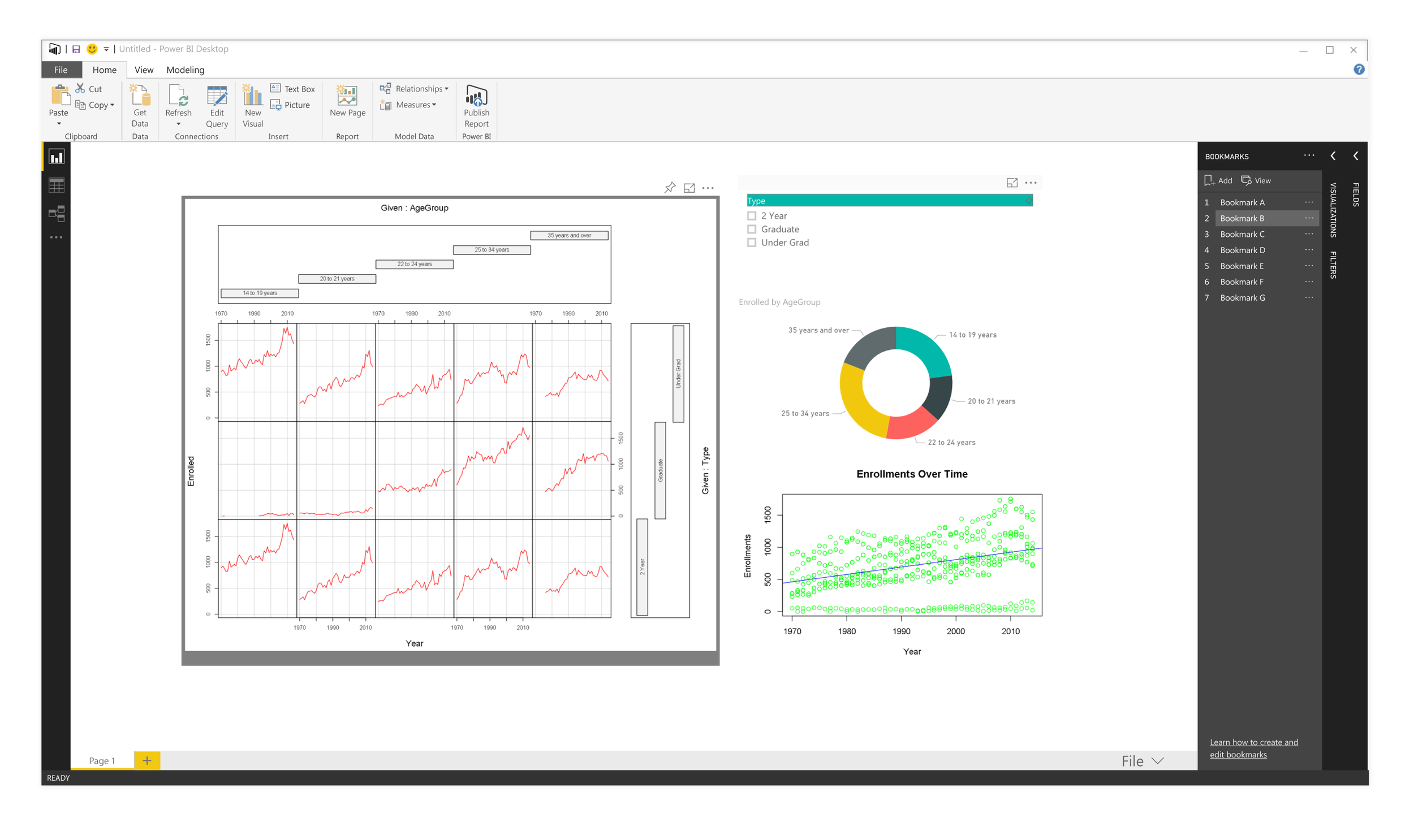
Bookmarking pane in context, with Fields list and Format pane collapsed.
Re-ordering bookmarks
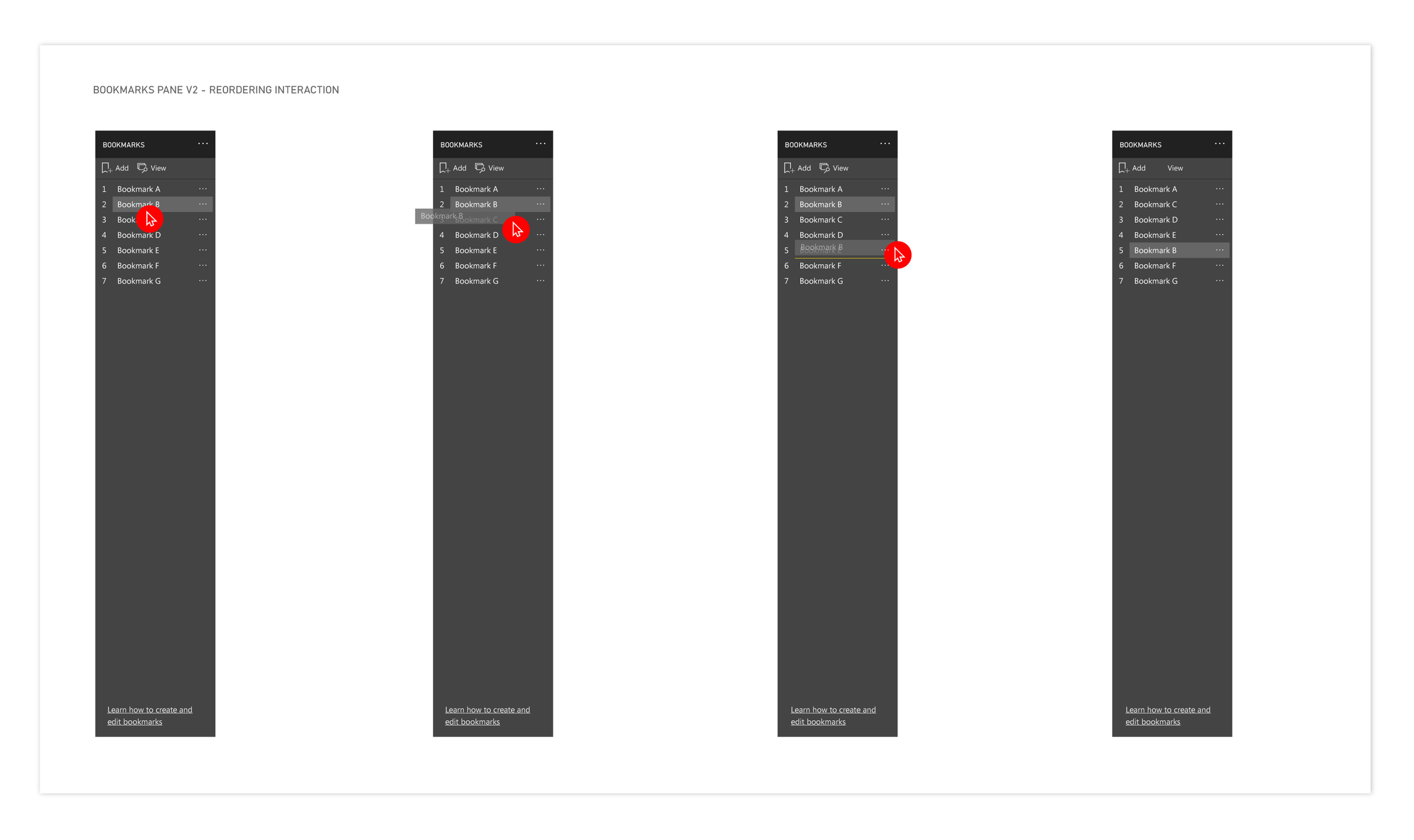
Another feature we introduced was the ability to re-order bookmarks. I designed this to be a simple drag and drop interaction with the yellow line showing clearly between which bookmarks the re-ordered one would land. The slight change in opacity of bookmark being re-ordered also helps reinforce user understanding that the bookmark is being moved.
Empty state
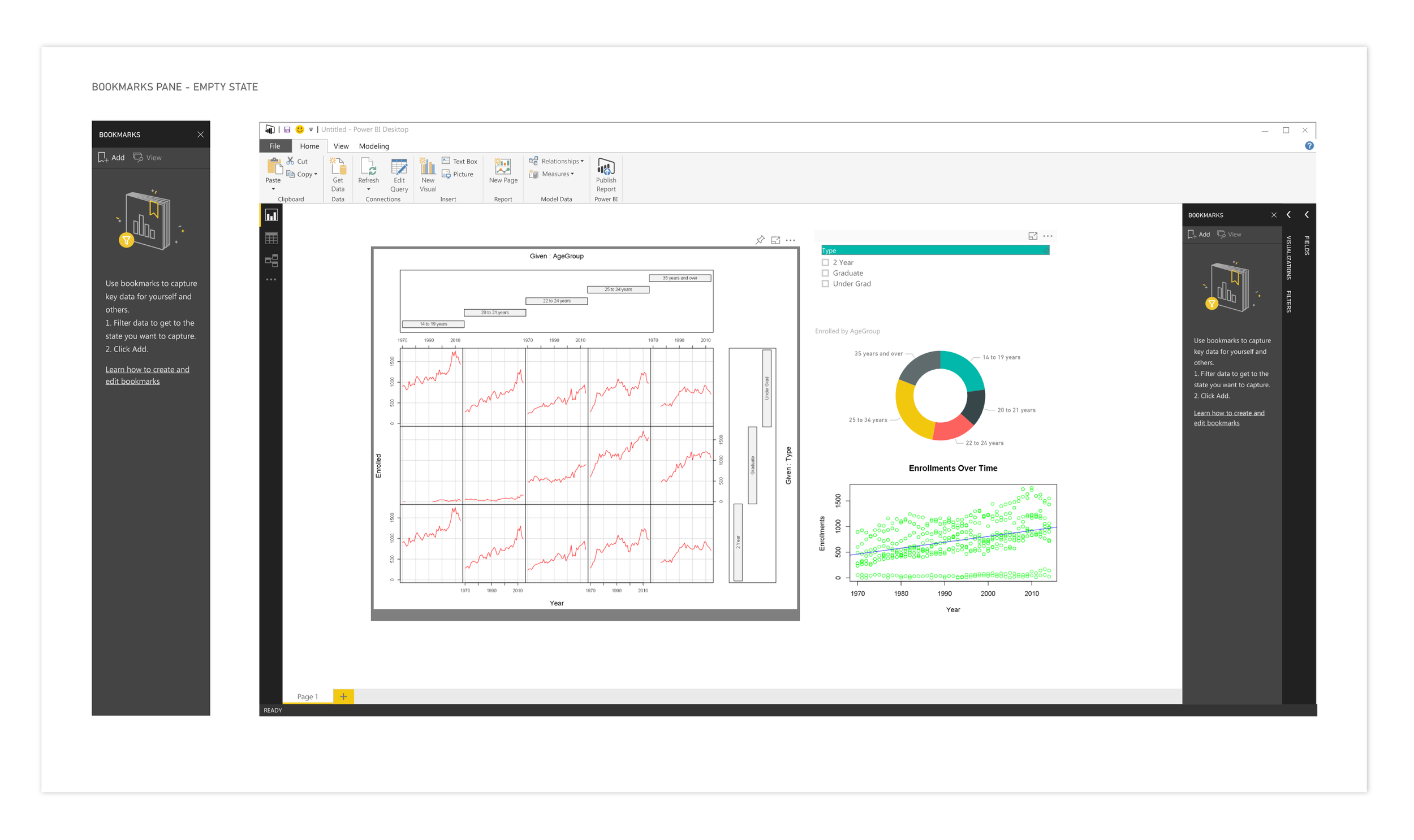
This image shows the empty state for the first time a user opens up the bookmarking pane. The goals here were to give them clear information on how to get started as well as additional documentation if they wanted to dive deeper.
Tracking impact
Our first opportunity to track feedback and impact around this feature was at the Data Insights Summit. We had a fully working demo that users were able to work with and give real-time feedback around the designs and interactions. This helped to guide several updates and changes to the feature that include:
Adding numbering
Adding the ability to re-order bookmarks
Boosting the functionality around updating existing bookmarks
After the Summit, this feature went into preview mode where we were ability to collect more feedback from our users. Bookmarking was well-received and allowed our users to tell stories with their data and use Power BI in presentations in ways they couldn’t before.
Below are some links on the web to learn more about bookmarking in Power BI.
Power BI Desktop October Feature Summary
Create an app-like Experience in Power BI with Bookmarks
Power BI Bookmarks - Data Bear Blog